The header, footer, favicon and color mode are global configurations in the help center, meaning they are visible on every page within a help center site.
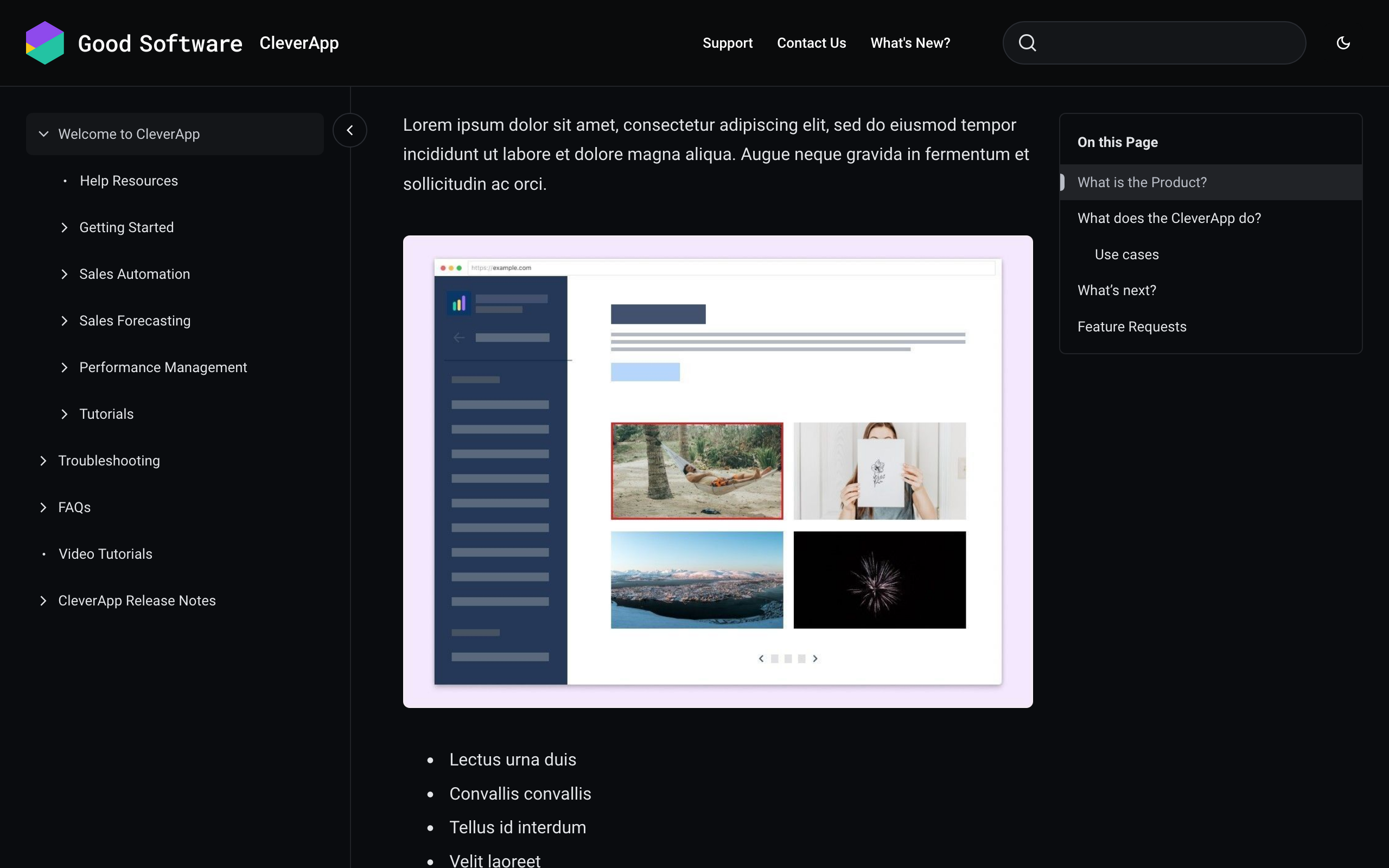
Please refer to our recommended image dimensions when uploading custom images.
Favicon
Add a favicon for your help center so users can easily recognize it in their browser. A favicon is typically displayed in the browser's address bar or in bookmark lists (next to the website name).
To brand your site and set a custom favicon, open the theme configurator tab Site and in the Global section you can upload your Favicon.
Color Mode
Set a color mode
Set a color mode for your site. You can choose between light (default) and dark. Once set, all pages of your site will display in the selected color mode for all users (independent of their own system preference).
To set a color mode for your site, open the theme configurator tab Site and in the Global section you can turn use the Color mode dropdown menu to select between Light and Dark.
Enable a color mode picker
As an alternative to setting a color mode for your site, you can enable a color mode picker, so your site visitors can choose themselves if the site displays in Light (default), Dark or Auto (according to their system’s configuration).
The color mode picker will be added to your site’s header and is therefore available from all pages in your site.
To enable the color mode picker for your site, open the theme configurator tab Site and in the Global section you can turn the toggle Color mode picker on.
Optimize theme settings per color mode
To ensure optimal visual results in each of the color modes, you can define and upload a light and dark variant of the following theme settings:
-
Header and footer logo
-
Portal and content source page banner image
-
Portal and content source page banner text color
-
Header and footer background color
-
Header and footer text color
Header
The header is shown at the top of every page in your help center site.
To brand your site and customize the navigation experience for your site visitors, open the theme configurator tab Sections where you’ll find all Header settings.
Settings within the theme editor
-
Logo: Upload an image file with your logo, specifically for the header.
-
Logo size: Adjust the size of your logo by defining its height on a scale from 24 to 56 pixels.
-
Site name: If the toggle is turned on, the name of the current content source (space or Scroll Document) appears next to the logo. On the portal page, the site name is shown (as set at site creation).
-
Background color: Select a color for the site’s header.
-
Text color: Select a color for the text in the site’s header.
-
Links: Add navigation links to the header. Specify the link label, link URL and whether the link should open in the same or a new tab.
Footer
The footer is shown at the bottom of every page.
To brand your site and customize the navigation experience for your site visitors, open the theme configurator tab Sections and scroll down to Footer.
-
Logo: Upload an image file with your logo, specifically for the footer.
-
Logo size: Adjust the size of your logo by defining its height on a scale from 24 to 56 pixels.
-
Background color: Select a background color for the footer.
-
Text color: Select a color for the text in the footer.
-
Links: Add navigation links to the footer. Specify the link label, link URL and whether the link should open in the same or a new tab.
-
Copyright: Input custom text for the copyright line.