The content source page represents the home for your space or Scroll Document content source and can be customized in various aspects.
When you create a site with the help center theme, each of your content sources (space or Scroll Document) is represented in your site with a content source page (accessible under yoursite.scroll.site/content-source-name).
Each content source page is built upon their respective space overview page (or in the case of a Scroll Document content source, the document root page). The content source pages can be further customized using the options provided in the theme configurator.
Overall, the theme configurator offers several different layout options for the content source page as well as optional components (like a description of your content source).
To customize how content source pages appear in your site, open the theme configurator tab Pages and scroll to Content Source Page.
Please note: Individual content source pages can’t be customized with unique settings. The settings that you choose will be applied to all your existing content source pages in the site.
Choosing a Content Source Page Layout
For the content source page, you can choose between three different page layouts. Each layout style will give your help center a different look and feel.
What elements you can customize in the content source template depends on the layout you choose. By default, the content source template uses the Hero layout.
Before starting to customize the content source pages, we recommend you select a layout from the Page Layout options in the theme configurator.
Use the comparison and overview table below to help you decide which layout style best suits your particular requirements.
Visual Appearance
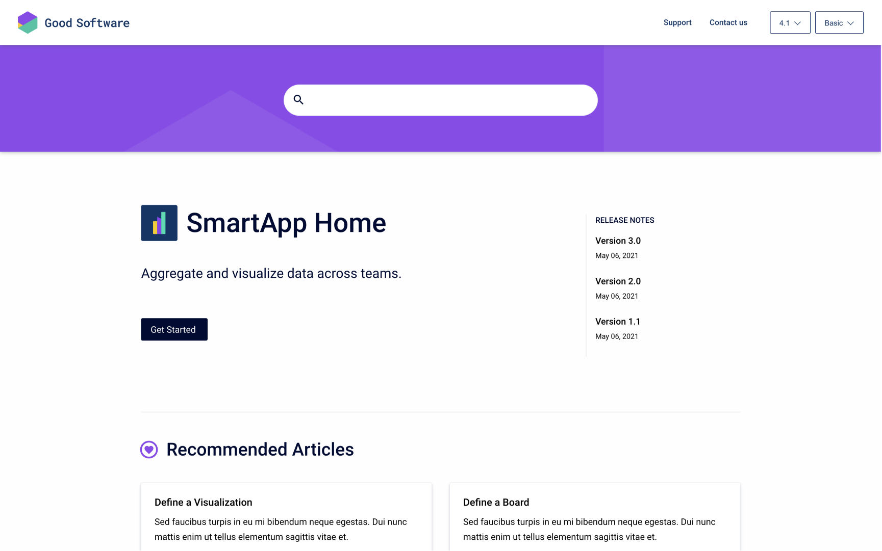
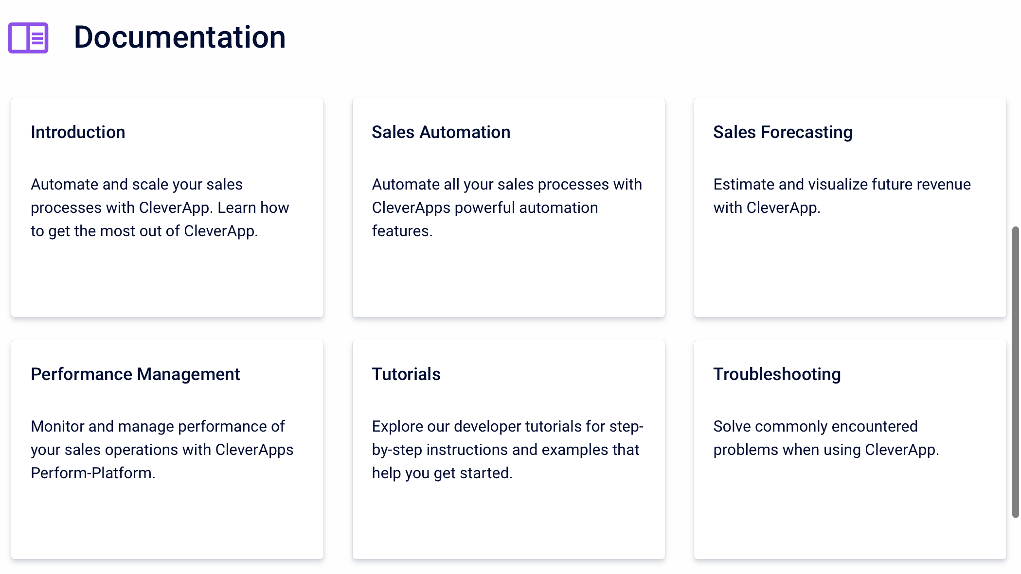
Hero layout
The hero layout displays a large hero banner that wraps a search bar, and below that, the content source title and (optionally) a short content source description.
-
The content source title comes from the title of the space overview page or Scroll Document
-
The content source description comes from the first 40 characters on the space overview page or document root page (working version). Characters after that limit will be cut off with '…'
|
|
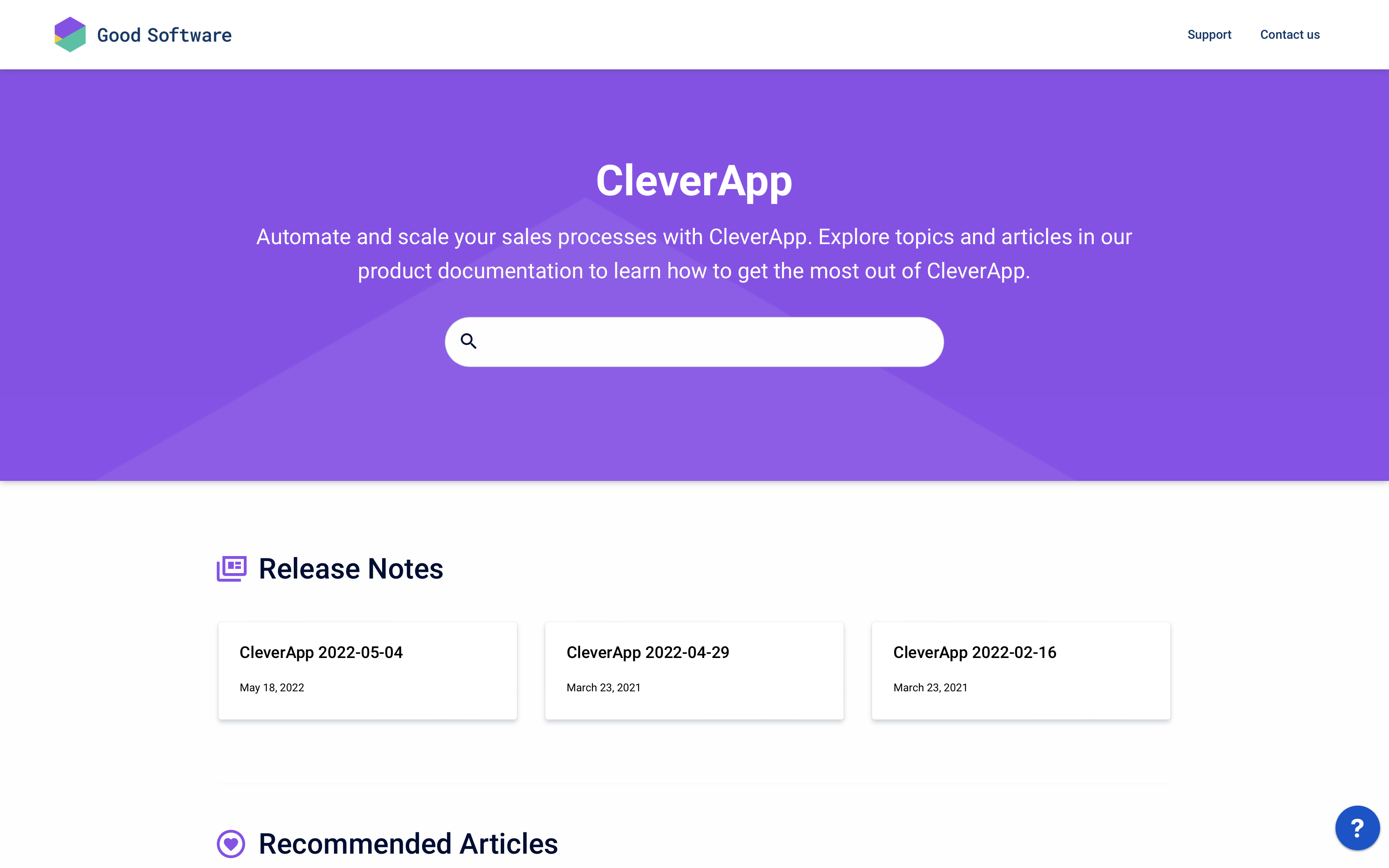
Details layout
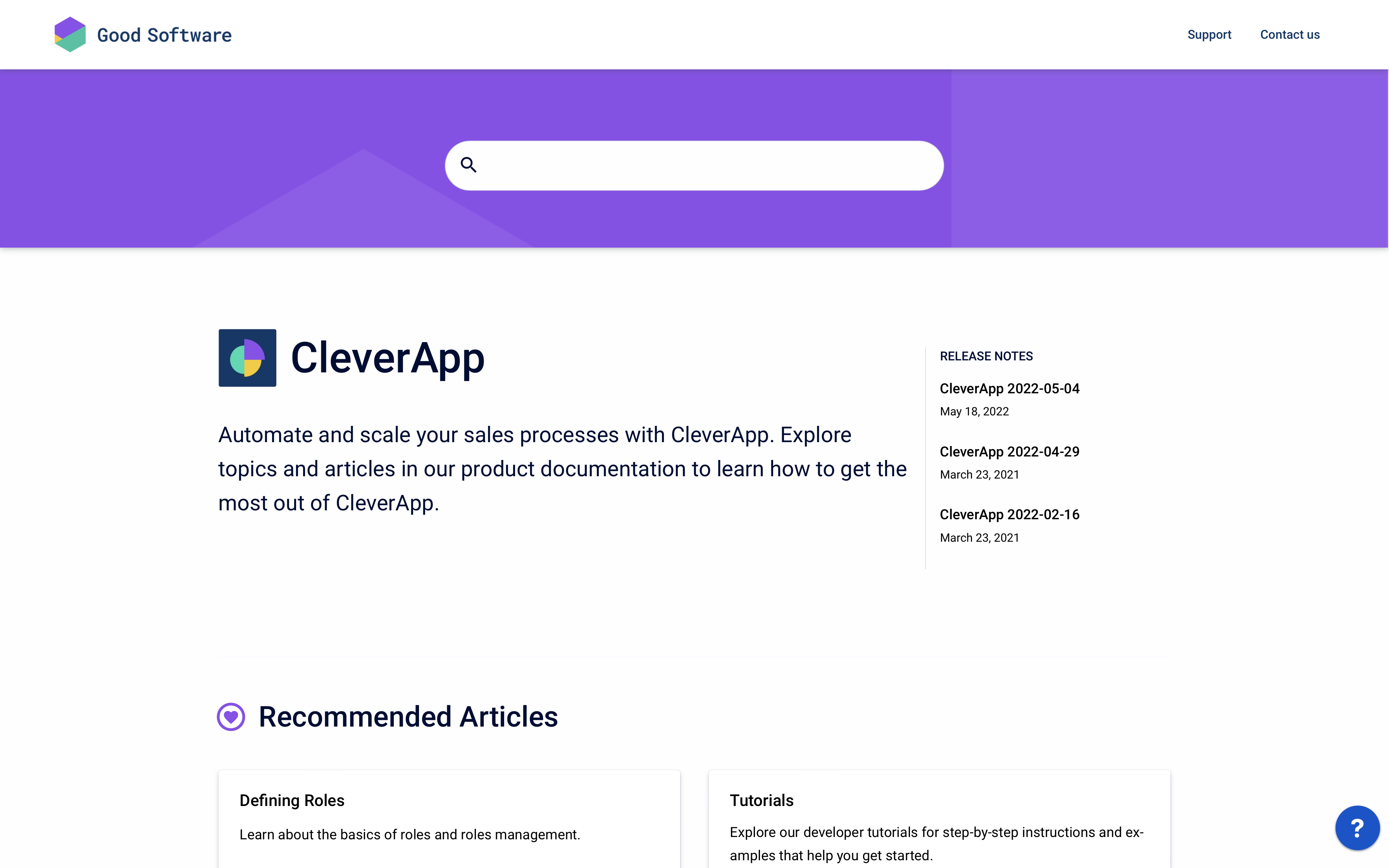
The banner behind the search isn’t as prominent as it is in the hero layout and only wraps the search bar.
The content source title, content source logo and (optionally) a content source description are displayed below the search bar. The description can be longer than in the Hero layout.
-
The content source logo comes from your space logo or Scroll Document cover image
-
The content source title comes from the title of the space overview page or Scroll Document
-
The content source description comes from the first 160 characters on the space overview page or document root page (working version). Characters after that limit will be cut off with '…'
Article layout
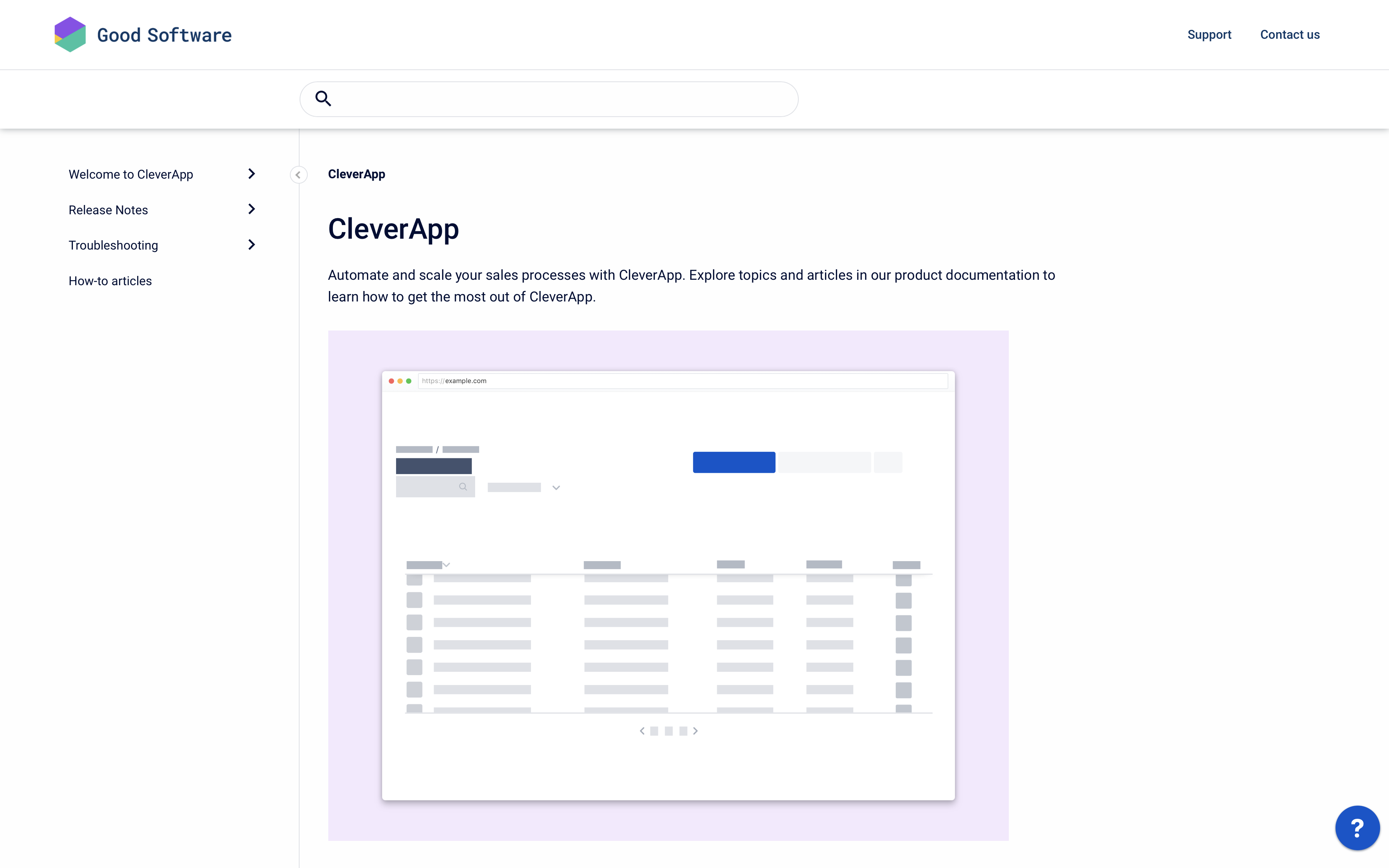
The article layout will treat your content source page just like any other article page in your site.
The focus of this layout is on the content. The search bar is a small element in the top right corner of the site.
Additional Options
-
News section
-
Pinned Pages section
These additional content sections display in dedicated rows above the topics section.
-
Call to action button
-
News section
-
Pinned Pages section
The News sections displays in a dedicated column to the right of the content source title and description.
The call to action button is placed right below the description.
The article layout will have all options that are also available in the article template.
Use the article template to enable additional options like table of contents or set the article width.
Optimized for
The hero layout is particularly useful if you are only using one content source in your help center.
When using only one content source, your content source page is also the landing page of your help center.
The details layout is particularly useful when using a multi-space help center in which every space is centered around a different product.
The article layout is particularly useful if you are using your site to publish anything other than a Help Center.
The content source page can contain a full page of additional content, and therefore reveals much more information than the rest of the layout options.
Customizing the Content Source Page Layout
Depending on the layout you select (hero, details or article), you will see different settings for the content source section in the theme configurator. Use the lists below to learn what and how you can further customize the content source page within a given layout.
Learn how to interact with the template settings in the theme editor to change the elements listed below.
Hero and Detail layout settings
The customization options offered for the hero and detail page layout are the same, expect for the optional Call-to-action button that is offered only in the detail layout.
-
Banner image: Upload an image to set a custom image for the background behind the search.
-
Banner text color: Set the color for the text that shows in the banner section (the text shown here is the title of your space home page or document root page).
-
News section and Pinned Pages section: You can choose to show additional section by enabling the corresponding toggle. Once enabled, these sections will:
-
Display in dedicated rows above the topics section and below the banner (first the news, then the pinned pages).
-
Pick up and display content that you have defined in Confluence via page labels.
-
Show a heading for the corresponding content section (only if you have inserted a heading in the provided text fields).
-
-
Content heading: Shows a title right before listing all pages contained in the content source (only if you have inserted a heading in the provided text fields.)
-
Content layout: Choose between three options (tiles, list or accordion). Find a detailed overview of the options further below.
-
Call to action button DETAIL LAYOUT only : Display a button that links to a selected page of your content source (will only show if you have added the page label scroll-help-center-cta-page to a page in Confluence). By default, the button will be labeled with the title of your Confluence page, unless you set a different title in the provided text field in the theme configurator.
The content source title, content source logo (which is your space logo or document cover image) and content source description (which is the text found on your space overview page or document root page (working version)) can only be changed in Confluence.
Article layout
The article layout style will display your content source page just like any other article page in your site. The content shown in this layout option is taken from your space overview page.
If article is selected, use the article page settings to further customize the appearance of your content source pages. Please note that with this layout style, it’s not possible to customize the content source page independent from your article pages.
Choosing a Content Layout (Only for Hero and Detail Layout)
The last section of your content source page is the content section. The content section displays all top level Confluence pages (and optionally all second level pages) of your content source.
You can choose between three different content layout styles. Each layout style will create a different experience for the users who navigate your help center.
Use the previews below to help you decide which layout style best suits your users' requirements or preferences.
Tiles
List
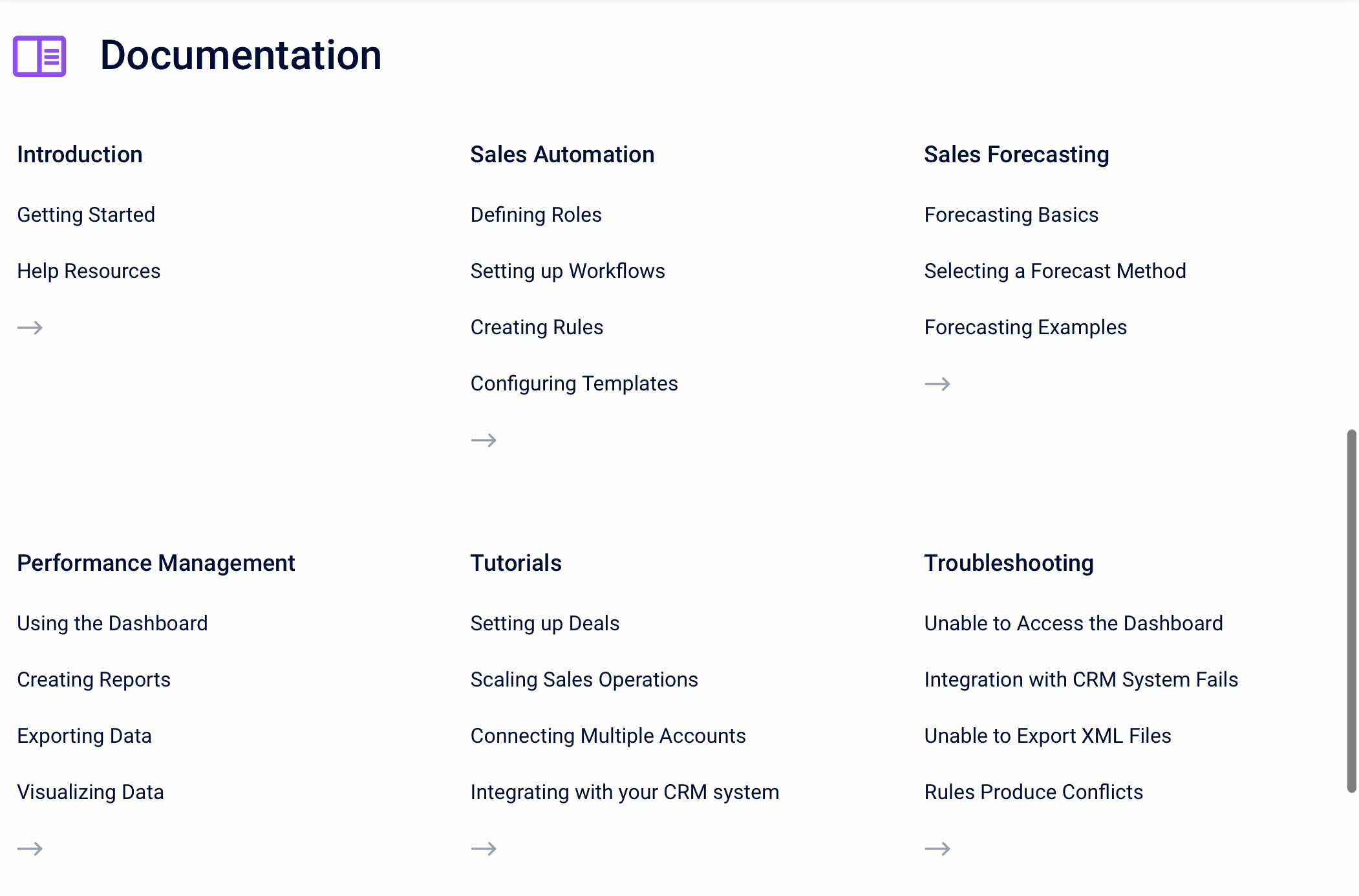
Accordion
The Tiles content layout style will show the top level Confluence pages of your content source as clickable tiles.
The tiles include the article title and description.
-
The Confluence page title is displayed as the article title.
-
The first lines of content in your Confluence page is displayed as the article description. It truncates at 159 characters.
The List content layout style will show both the top level Confluence pages of your content source as well as the first four child pages nested below them.
A top level page will only show if it has at least one child page nested below it.
The Accordion content layout style will show the top-level Confluence pages of your content source as sections in an accordion menu. The menu can expanded to show the child pages.
The content hierarchy and content titles can only be changed in Confluence.
To change the content hierarchy, reorder the pages in your Conflunece space or organize the page tree of your Scroll Document. To change the content titles, set a different page title for the underlying Confluence page.