If you set up your help center with multiple spaces, you can customize the portal page to help your users begin their help experience.
Learn how to structure a help center with multiple spaces.
For the most part, the possible changes are done by manipulating Confluence data. The header bar and footer customization is done with global settings.
Portal Page Layout
You can choose from two portal page layouts, which largely have the same feature set. The spacious layout is the default one and displays a larger top banner and space tiles in portrait format. The compact layout displays a smaller top banner area and more narrow space tiles in landscape format. The compact format works well with smaller screen resolutions or large help centers with many spaces.
Theme settings
|
|
Name |
Type |
Example value |
Comments |
|---|---|---|---|---|
|
1 |
|
Other |
|
If this setting isn't set, the portal displays in the spacious layout. |
Search Bar and Banner Area
The upper area of the portal page displays a large hero banner that wraps the search bar and contains the title and subtitle of the help center.

You can customize:
Theme settings
|
|
Name |
Type |
Example value |
Comments |
|---|---|---|---|---|
|
1 |
|
Color |
#FFFFFF |
|
|
2 |
|
Filename |
my-banner.png |
If this setting isn't set, the area is filled with the header color. |
Confluence data
3. The title, which is the title of the home page in the root space. This is also the HTML title of this page.
4. The description, which is the content in the Excerpt Macro on the home page in the root space. If there is no Excerpt Macro on the home page, the first 40 characters on the page display as the description.
Space Tiles
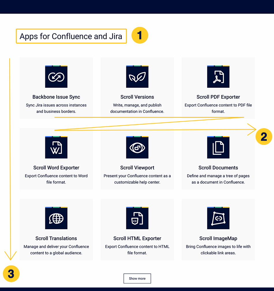
In the lower part of the page, users can navigate to the spaces within the help center by choosing a tile for the space.
This section only applies if you want all of your spaces to be shown together. If you want to categorize your spaces, skip to Space Tile Categories.

You can customize:
Theme settings
|
|
Name |
Type |
Example value |
Comments |
|---|---|---|---|---|
|
1 |
|
Free Text |
Our Apps |
|
|
2 |
|
Other |
SpaceKey1,Spacekey2,SpaceKey3 |
Enter space keys of the included spaces here. They'll display in the order you enter them. Unlisted spaces don't appear on the portal page. If left empty, Viewport will shows them in the order that Confluence returns (unknown) |
|
3 |
|
Number |
3 |
Each row displays up to three spaces. If you've added additional spaces, they're hidden under the 'Show more' button. |
Confluence data
4. The space logo on the tile is the space logo of the listed space
5. The title on the tile, which is the space name (Space Tools → Overview → Name)
6. The description on the tile, which is the description of the space (Space Tools → Overview → Description)
Space Tile Categories
For large help centers with many spaces, the Help Center theme provides a way to organize spaces into up to categories. Categories can be displayed as sections with their own headings on the portal page or be selected from a picker.
Theme settings
|
|
Name |
Type |
Example value |
Comments |
|---|---|---|---|---|
|
1 |
|
Free Text |
Our Data Center Apps, Our Cloud Apps |
Enter a name for the category. This name is used for the heading and the URL for the category. |
|
2 |
|
Other |
SpaceKey1,Spacekey2,SpaceKey3 |
Enter space keys of spaces to be part of a given category. They'll display in the order you enter them. |
|
3 |
|
Number |
3 |
Enter a number of rows per category. Each row displays up to three spaces. |
|
4 |
|
Other |
|
Determine what displays on the portal page if no category is defined in the URL. There are two options:
|
