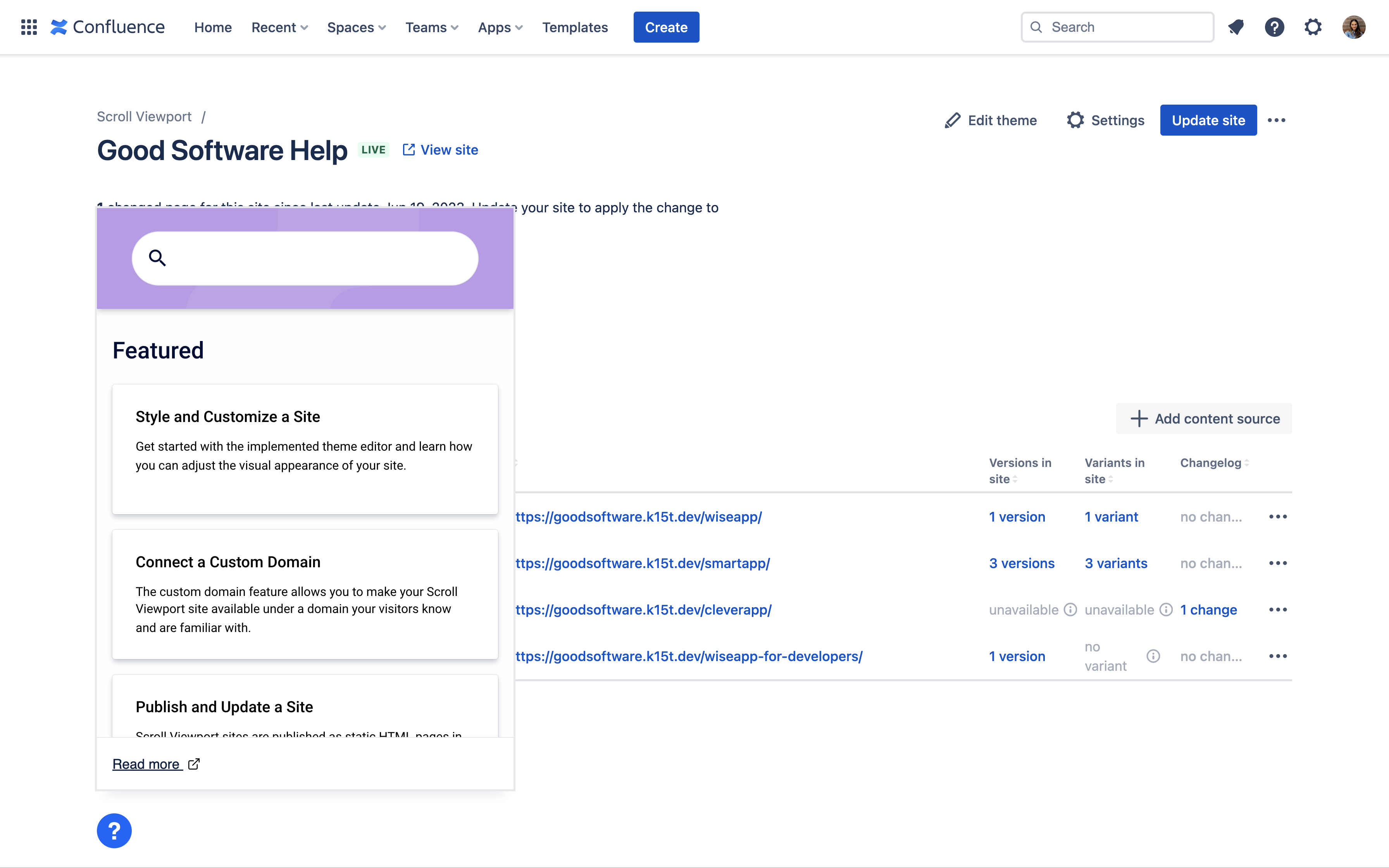
The Viewport Help Center Widget lets you embed help from your help center anywhere in your application, website or other assets.

Embedding in-app help allows your users to find and open help content directly in the right context of your app without forcing them to navigate to your Viewport help center.
Copy and insert our widget script in order to display a simplified view of any Viewport page. Customize the view further by adjusting a range of attributes.
Please note, your Viewport site needs to be live and publicly accessible for the widget to display.
Insert the Help Center Widget Script
Including the widget script into the head section of your app’s or website’s HTML is the easiest way to install the Help Center Widget.
-
“Copy the following script into the
<head>section of your app or website:HTML<script type="module"> import { initializeHelpCenterWidget } from 'https://[Domain of live site]/__theme/js/help-center-widget.js'; initializeHelpCenterWidget({ url: 'https://[Viewport URL]' }); </script> -
In line 2 of the script, complete the URL with the domain of your live site (e.g. 'https://example.scrollhelp.site/__theme/js/help-center-widget.js')
-
In line 4 of the script, replace the part after
url:with the URL of the page you want to show in the widget. Choose-
an article page if you want to show content of a specific article directly in the embed view.
-
a content source page if you want to let your users search or select from your pinned pages for further reading.
-
-
Paste the complete script into the
headsection of the HTML of your app or website
The script will automatically place the widget at the bottom right of your web page or application. You can refer to the attributes below for additional positioning options.
The Help Center Widget can also be initialized by placing the <help-center-widget> element manually inside the body section.
Change Position and Behavior of Widget Elements
You can change the position of the widget button and dialog and its behavior by setting additional attributes.
Attributes can be set directly on the <help-center-widget> element or on the options object which is passed to the initializeHelpCenterWidget() function.
|
<help-center-widget> |
initializeHelpCenterWidget() |
Type |
Description |
|---|---|---|---|
|
|
|
Allowed values
Default
|
The position of the button on the website.
|
|
|
|
Allowed values
Default
|
The position of the pop-out window relative to the button.
|
|
|
|
Default
|
The initial state of the window. It will be visible if This attribute value on |
|
NOT AVAILABLE |
|
Allowed values
Default
|
A CSS selector which points to an existing element inside the web page. This element will be replaced with a |
Advanced Customizations
Users who are experienced with custom CSS can customize the look and feel of the widget further using CSS custom properties.
If you prefer using your own buttons and use custom dialogs, you can also implement in-app help using an iframe instead of our Help Center Widget.
Read more on Advanced In-App Help Customizations
Related Pages
- Embed In-App Help
Use the Scroll Site’s Help Center Widget to embed help directly within your own app.
- Embedding Help – Best Practices
Learn how to use Scroll Site’s in-app help feature properly so your users can use the content on your help center site conveniently right from your application or website.
- Embedding Help – Best Practices
Learn how to use Viewport’s in-app help feature properly so your users can use your content conveniently right from your application or website.
- Advanced In-App Help Customizations
Learn how to install, tailor and customize your in-app help to fit into and seamlessly integrate with your app or website.
- Embed In-App Help
