The Help Center theme is a bundled theme included in Scroll Viewport. The Help Center theme provides a professional look and feel to content authored in Confluence and is ideal for publishing product documentation or a knowledge base.
In this section, you'll learn more about the structure of the Help Center theme and what you can customize.
How the Help Center Theme Is Optimized
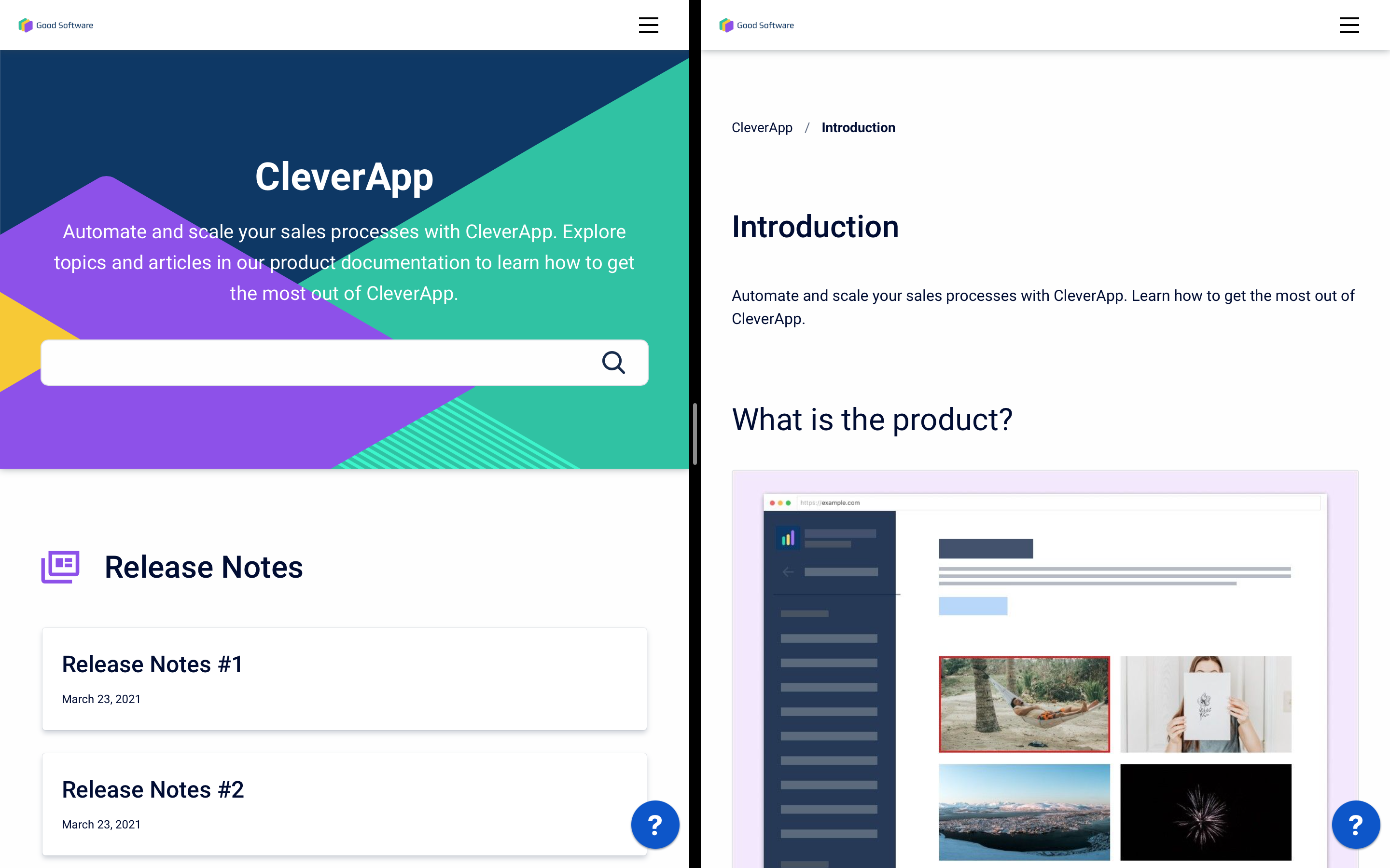
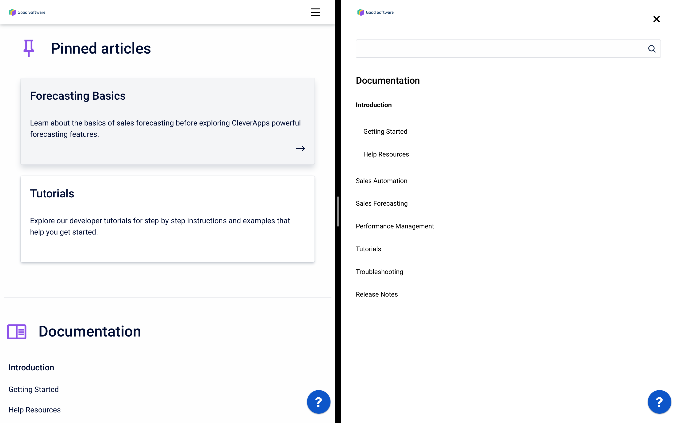
The Help Center theme is optimized for whatever device your users view your help center on. Whether it’s desktop, a tablet or mobile, your help content will be displayed optimally.
Users will be able to access your support widget and menu bar even on the smallest of screens.
Structure
Sites using the Help Center theme have up to three hierarchy levels:
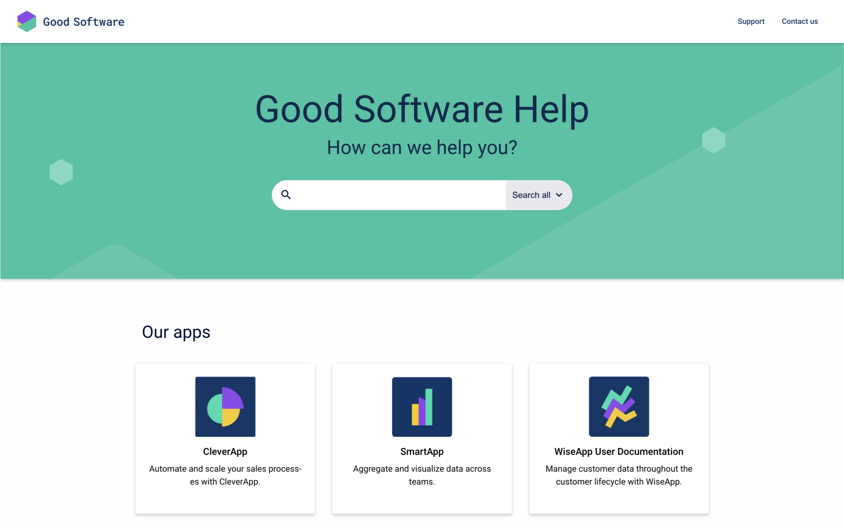
Portal page:
If multiple content sources are added, the portal page unifies all of them with an overview as well as a search bar that searches all of the site's content.
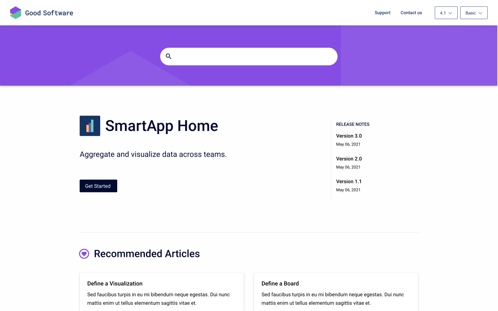
Content source home:
This page provides search and navigation within a single content source.
Article pages:
These correspond to Confluence pages and represent their hierarchy and content.
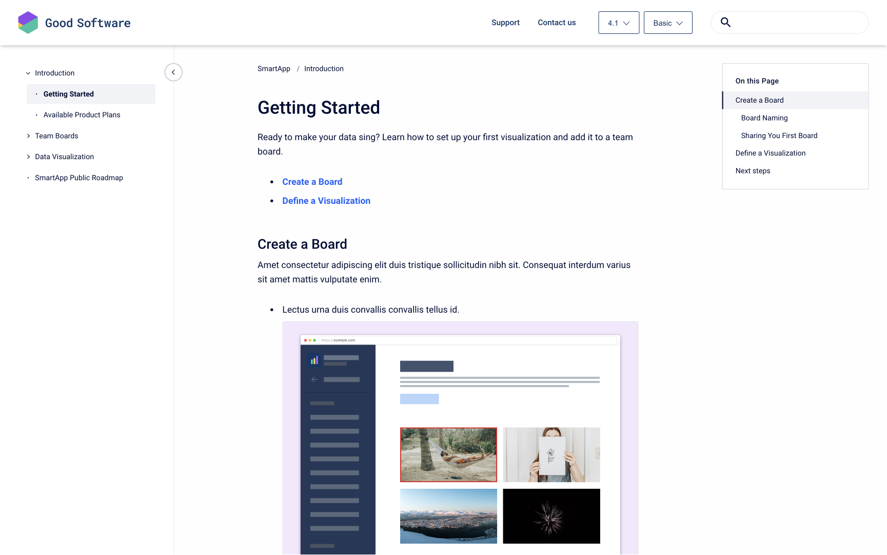
Customizable Elements
To make sure the published site fits your online presence and company branding, you can customize its appearance using the Templates tab in the theme editor.
To allow for easy navigation through the site, some elements of the help center theme cannot be removed (e.g. header logo, article topics or article navigation).
There are also some site templates like the 404 page that can’t be customized and don’t appear in the theme editor. Learn more in Fixed Templates
Learn how to interact with the template settings in the theme editor to change the elements listed below.
Global elements
Elements under this category appear in all pages of the Scroll Viewport site.
Learn how to Customize Header, Footer, and Favicon Find an overview of all available options for the header and footer below.
Header
These settings affect the appearance of the top navigation bar on all pages of your site.
You can include a site (header) logo, a site name and navigation links and change the header text and background color.
Footer
These settings affect the appearance of the footer on all pages of your site (on the bottom of your site).
You can include a footer logo, a site name and navigation links and change the copyright text, footer text color and footer background color.
Pages
Please note: Individual pages can’t be customized with unique settings. The settings that you apply at a page level will be applied to all pages of that type, across all content sources within that help center.
Portal
The portal page is only available if more than one content source is added to your site (available under yoursite.scrollhelp.site).
The portal page is divided into a banner section (with titles and a background image) and a content source tile section. Both sections are customizable.
Learn how to Customize the Portal Page.
Content source
These settings affect the home page of every content source (if you have added four content sources, you have four different content source pages):
-
Layout type: Choose a layout for your content source pages (Options: Hero, Detail and Article layout).
-
Topic type: Choose how you to want to navigate your users to article pages. (Options: Tiles, List and Accordion)
For an overview and comparison of all the offered layout and topic types and all additional options, refer to our article Customize the Content Source Page .
Article
These settings affect how articles are displayed:
-
Breadcrumbs: Toggle a hierarchical list of pages to display above the article title.
-
Table of contents: Toggle an interactive table of contents in the top right of the article.
-
Article pagination. Add ‘previous’ and ‘next’ links to the bottom of all your articles.
Learn how to Customize Article Pages.
Additional settings
These settings affect the behavior of the entire site, like the cookie policy.
Cookie notice
-
Display cookie notice: Check if visitors of the site should be notified about the cookie policy with a pop-up.
-
Cookie notice text: Input your custom text informing the visitor about the cookie policy.
-
Link: Input a link text and link target, for example to your privacy policy.
-
Tracking behavior: Select between opt in and opt out behavior.
-
Opt in: Tracking (setting the cookie) doesn’t start until the visitor explicitly gives their consent.
-
Opt out: Tracking starts upon opening the site and continues until the visitor explicitly rejects their consent (please note that this setting is not GDPR compliant).
-
