Viewport’s theme tokens enable you to customize the look and feel of your Help Center with ease.
Leverage the power of Viewport's design token system inside the Help Center theme's custom CSS. Use tokens to create new theme styles that align your theme's appearance with your brand's needs.
This page will give you an overview of all available theme tokens and provides some common examples for how to apply these tokens.
Available Theme Tokens
|
Token name |
Type |
Description |
|
|---|---|---|---|
|
1 |
|
|
Used for adjusting the font family of the overall site text |
|
2 |
|
|
Used for the body text color across the site. |
|
3 |
|
|
Used for adjusting the text size across the site. Default value: Example: Setting it to |
|
4 |
|
|
Used for adjusting just the headline font family |
|
5 |
|
|
Used for the headline text color across the site. |
|
6 |
|
|
Used for adjusting the headline size across the site. Default value: Example: Setting it to |
|
7 |
|
|
Used for the site’s header text color |
|
8 |
|
|
Used for the site's header background color |
|
9 |
|
|
Used for adjusting the site’s header height |
|
10 |
|
|
Used for the site’s footer text color |
|
11 |
|
|
Used for the site’s footer background color |
|
12 |
|
|
Used for the site’s banner text color |
|
13 |
|
|
Used for the site’s banner image, used on the portal and content source pages. Example: CSS
|
|
14 |
|
|
Used for the site’s banner background color. |
|
15 |
|
|
Used for adding a custom color in several places across the site e.g. tiles, page tree, pagination, links, buttons, table of contents. |
|
16 |
|
|
Used for the elements which might occur on top of the brand color e.g. text in a button. |
|
17 |
|
|
Used for the site’s container width. Bigger value results in wider site. |
|
18 |
|
|
Used for the offset between a scrolled to anchor and the site’s sticky header. |
|
19 |
|
|
Used to control the overall roundness of the site. Default value: Setting it to |
Examples
Changing font family and text sizes
To change the default Help Center theme font for text and headings to a different one, we recommend injecting your code similar to the example below where we change the font family, text scale and color of headlines.
:root {
  --vpt-theme-text-font: "Trebuchet MS", Verdana, sans-serif;
  --vpt-theme-headline-font: Georgia, serif;
  --vpt-theme-text-scale: 1.125;
  --vpt-theme-headline-scale: 2;
  --vpt-theme-headline-color: indigo;
}
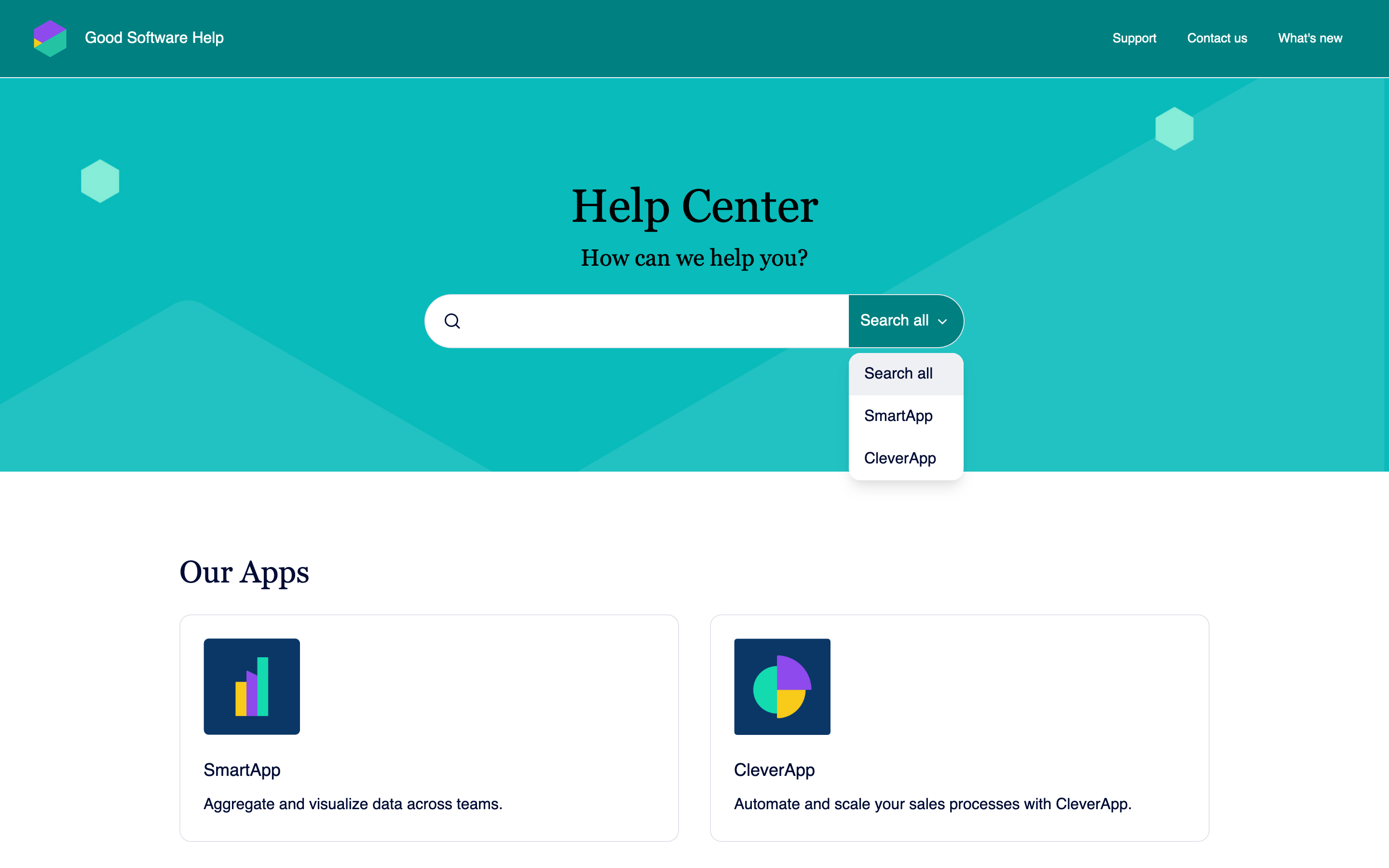
Creating a distinct theme style
Craft theme styles that align with your brand’s needs. In the following examples we used only a hand full of tokens to drastically change the overall appearance of the Help Center theme.
:root {
  --vpt-theme-headline-font: "TypewriterMS", ui-sans-serif, sans-serif;
  --vpt-theme-text-font: "Verdana", ui-sans-serif, sans-serif;;
  --vpt-theme-header-background-color: ghostwhite;
  --vpt-theme-header-text-color: black;
  --vpt-theme-banner-background-color: gold;
  --vpt-theme-banner-text-color: black;
  --vpt-theme-footer-background-color: ghostwhite;
  --vpt-theme-footer-text-color: black;
  --vpt-theme-primary-color: darkmagenta;
  --vpt-theme-on-primary-color: white;
  --vpt-theme-roundness: 0.125;
}
:root {
  --vpt-theme-headline-font: "Georgia", ui-serif, serif;
  --vpt-theme-text-font: "Garamond", ui-sans-serif, sans-serif;
  --vpt-theme-header-background-color: teal;
  --vpt-theme-header-text-color: white;
  --vpt-theme-banner-text-color: black;
  --vpt-theme-banner-background-color: teal;
  --vpt-theme-footer-background-color: ghostwhite;
  --vpt-theme-footer-text-color: black;
  --vpt-theme-primary-color: teal;
  --vpt-theme-on-primary-color: white;
  --vpt-theme-roundness: 6;
}
Advanced Use Cases
Use the following techniques and utilize the comprehensive design token system for more advanced and fine grained customizations of the Help Center’s look and feel.
-
Add Custom Fonts Custom fonts elevate your brand identity and inject personality into your site.
-
Restrict CSS styles to specific article pages Sometimes it is necessary to change the CSS styling for specific article pages only. Using the Confluence page ID, you can control on which pages exactly your styles apply.
-
Restrict CSS styles to page templates Sometimes it is necessary to change the CSS styling for all pages with a specific page layout. By utilizing the predefined page layouts, you can control which pages your styles apply to.
-
Design Tokens A list of all design tokens provided by Viewport’s help center theme.
-
Components Use the CSS custom property interface of our officially supported components to customize specific components of the Help Center theme.