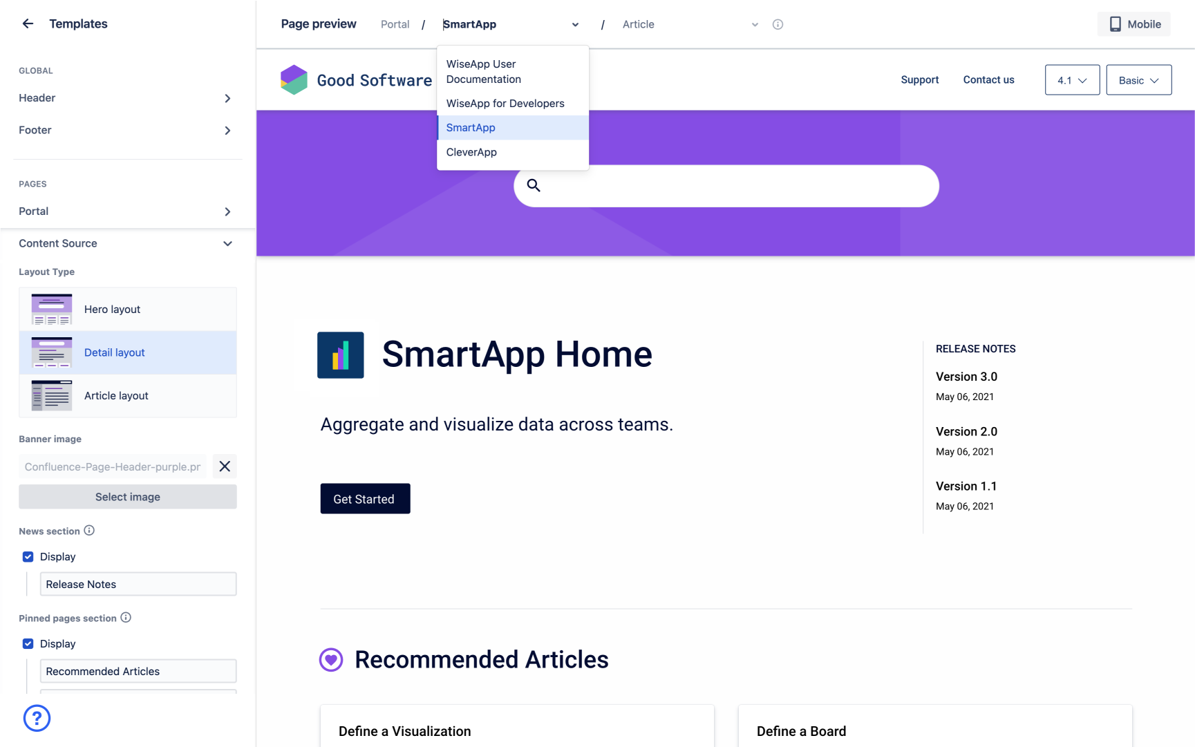
Scroll Viewport's theme editor lets you adjust the visual appearance of your site. Currently, all Viewport sites are based on the Help Center Theme. This theme determines the overall look and feel of the site.
The Templates menu in the theme editor contains styling options for all HTML templates that are used to generate your site.
To access these styling options, from the single site overview click Edit theme > Templates.

The theme editor consists of:
-
A sidebar on the left with all available templates and template styling options.
-
A theme preview on the right that immediately reflect all changes made to the theme. Please note that you cannot interact with the elements in the preview.
-
A theme preview navigation on top of the theme preview. Use the article and content source dropdown to preview how specific pages in your site will display on your live site.
Overview of all Site Templates
Site templates that can be customized are split into two categories in the theme editor: Global and Pages.
There are some site templates like the 404 page that can’t be customized (yet) and don’t appear in the theme editor. Learn more in Fixed Templates.
Global templates
Global templates are used on all pages of your site. Any changes applied to global templates will be visible to users everywhere they navigate within the site.
Currently, the settings in this section are determined by the structure of the Help Center Theme. The Help Center Theme allows you to customize:
-
the site’s header
-
the site’s footer
-
the site’s favicon (available under the section 'header)
Learn how to use the global template settings to Customize Header, Footer, and Favicon .
Page templates
Page templates are used for specific pages in your Viewport site. Any changes applied to a page template will be only be visible to users when they are on pages that use that specific template.
Currently, the settings in this section are determined by the structure of the Help Center Theme. The Help Center Theme allows you to customize:
-
The article page
-
The portal page (Options for these templates are only shown if more than one content source is added to your site)
Additional Settings
Additional fields in the templates editor include:
-
Cookie notice settings
-
Custom CSS editor
-
Custom Javascript editor
You can choose to enable or disable the cookie notice. Once enabled, you can configure how the notice behaves and displays.
You can use the code editors to inject custom CSS or inject custom Javascript to your site. We recommend that you only use the code editors if you find that the visual theme editor doesn’t provide your required styling options and if you have the required knowledge to write and maintain the custom code.
Changing Template Settings with the Visual Theme Editor
Learn how to interact with the Visual Theme editor and its template settings.
Find a detailed list of all available template settings in our Overview of the Help Center Theme.
Changes to the template settings won’t affect your live site until you click Save, close the theme editor, click Update site and Go live. Learn how to Publish and Update a Site.
|
Option |
Usage |
|---|---|
|
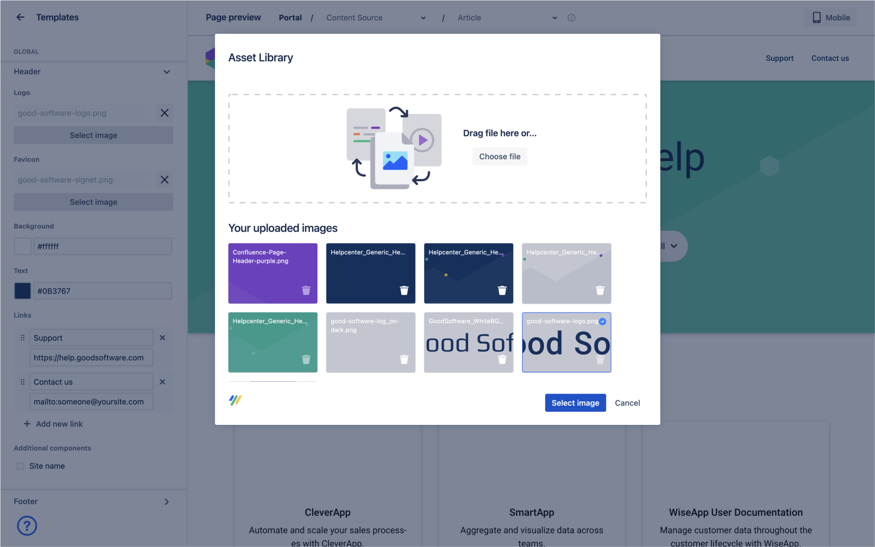
Uploading images to the Asset Library |
|
|
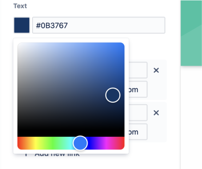
Choosing colors with the color picker |
|
|
Add links using the link fields |
|
|
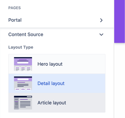
Select a Layout Type |

Selecting a layout in the Layout Type menu will add or remove elements and restructure the page. Keep an eye on the theme preview to see the differences between layouts. Overview all available layout options for the content source page and the portal page. |
|
Display additional sections using Confluence page labels |
Overview all available page labels and learn how to Define Pinned, News and Call-to-Action Pages. |
|
Insert site descriptions in text fields |
See texts in your site but no matching text field? Some texts are automatically set by your Confluence content and can’t be changed in the theme editor. Learn how to Change Descriptions in the Site. |
|
Add icons to sections by referencing Material Design Icons |
|


